10/6
Final Infographic
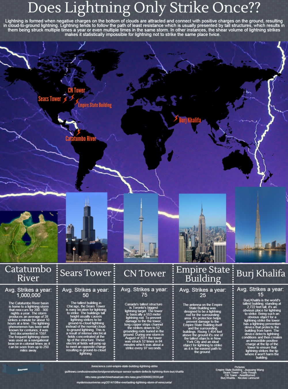
- The misconception I addressed was that lightning only strikes the same place once. My infographic helps correct this by giving examples of locations where lightning has struck more than once.
- it shows the information by placing the locations on a map and showing pictures and then the average number of strikes each location receives a year.
- I segmented each location so all the information for it is in one little column. I also removed the lines from the original draft which where kinda weird compared to the rest of the infographic.
- I’m most proud of the fact that it looks somewhat decent. there was other things I wanted to do but pictochart just didn’t have the functions or capabilities for me to do exactly what I wanted.
- conveying information through graphics takes time if you want it done right and accurately so the viewers aren’t confused or mislead. It’s also a pain to sift through all the information when you google for something specific and it hides the result you want among 200 other unwanted results.
Ta-da
10/2
Infographic draft peer review
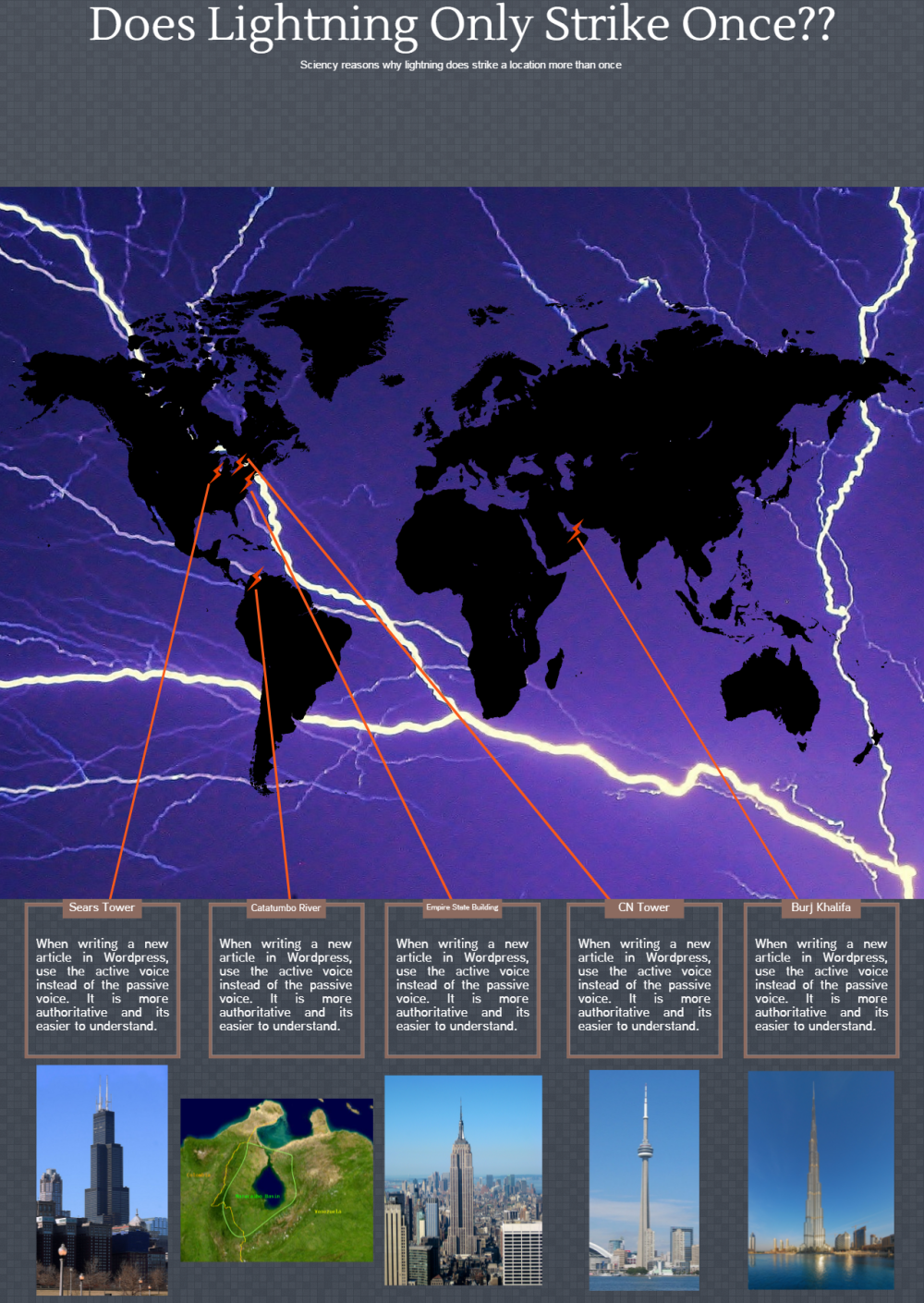
Draft of inforgraphic. Basically the layout and design. Still have to add the intro q paragraph and details about each location.
9/23
1. What topic (misconception) are you considering for your research project and why?
Lightning doesn’t strike the same place twice
2. In one sentence, state the goal of your infographic as it relates to the misconception you’ve chosen. What is it supposed to show?
The infographic goal will be to show that lightning can strike places, objects, thing more than once.
3. Who will be the intended audience for your infographic. (Think specifically here. Don’t just say “Anyone who is interested in…”)
the intended audience will most likely be students in basic science classes where science and technology myths are often conveyed.
4. Lessig writes that good remixes deliver a more powerful message than any original source or than text alone. How will your infographic accomplish this? Why will it be more persuasive to your audience than the individual sources you read?
the use of relative pictures to match source information and combining them in a way that makes sense
5. Which one or two infographics from the course text would you like to use as an example for your own work? Why?
Perilous Journeys on pg126-127. it is the most similair to how I imagine what my infographic will look like with pictures of a specific thing with the details right by it
6. Make a detailed list of the data and information that you need to find and consider some ideas for the types of sources you might look for. The more developed this section is, the better you will be able to use your library time on Friday.
The number of lightning strikes tall buildings recieve, weather centers that track lightning strikes, a report on lightning and why it strikes where it does, other lightning studies


The topic itself is interesting and the target audience is great because that misconception lasts at least until middle school or even high school. The base infographic is a good because I too can picture an infographic about lightning strikes using that base.
LikeLike
I love this idea for a topic! It’s shows some out-of-the-box thinking, and I think it will be really cool! It’s such a common saying that it will be cool to see how you disprove it.
LikeLike
Bib-Board
1. Has only 6 pins. Need two more. 3 sources are from .gov sites and 1 is a research article fulfilling the 3 scholarly sources requirement. One source has no caption and one has only one sentence.
2. The psu.edu source is a bit brief and doesn’t explain how it will be used.
3. A table listing lightning strikes on major US skyscrapers would be useful because it would provide raw facts.
4. Besides completing all the sources, providing explicitly how each source is useful would be the most beneficial.
LikeLike
1. I can tell from this article that it is going to prove that lightning strikes in the same location more than once. I think the overall goal is clear and precise.
2. I found out that lightning has hit multiple places more than once. And in fact has hits some locations many times.
3. I think the infographic is only unclear because it is not yet fully complete. The infographic is heading in the right direction though and looks to me as if it will be finished nicely.
4. I believe that the design is very good. The overall layout is very easy to understand and portrays the goal clearly.
5. Like I said it is hard to say what they can improve on just because it is not complete. But maybe making the colors complement eac hother a little better would be good. Also Adjusting the font sizes and fronts to correctly portray the goals of the infographic….
LikeLike